

(This post is part of the 31010 Series of posts on Risks & Ventures. For more information on this series please follow this link).
“A picture is worth a thousand words.” (1)
Earlier in my career when I was giving a lot more Powerpoint briefings than I am most of the time today, I was frequently reminded by my managers to try to cut down on words in the presentations I was developing.
Not that this was usually an issue for me, but it was something that managers everywhere do like to say. In fact, more often than not because I was the one who had done all the supporting research and analysis for the slides I was more familiar with the subject matter and less in need of verbal prompts than my busy managers who had more competing priorities and less time to process the content.
The point though that sometimes ideas can better summarised and expressed using pictures, graphs, infographics and diagrams has been well established, and in formal risk management practice a specific technique called causal mapping can be used to analyse and present issues, including the linkages between them. It’s included in IEC 31010 as a technique for “analysing dependencies and interactions.”
The basic purpose of causal mapping is to gather individual insights about an issue and built them into graphical representations or pictures that can show “events, causes and consequences” (2), and it can either add value in its own right as a standalone piece of analysis, or be a step in a larger analytical process.
As well as being used by businesses this technique is used very frequently by security and intelligence agencies to map the relationships amongst criminal or terrorist groups, and it is also a staple technique in stakeholder or customer analysis.
In fact you almost certainly already seen a version of this because almost every movie or series that involves a police investigation has a moment in it where you see a board in the background of an operations room showing evidence of crimes being linked to pictures of suspects, or maybe hierarchies of criminal groups on a pin board. This is a basic style of casual mapping because it’s a type of diagram that shows the way different ideas, people, objects and discoveries are related.
How does it work?
Like the other risk assessment techniques we have presented in this series of posts one of the main differences that separates the use of a technique in formal risk management setting and in other situations is the way that it is structured. This is also true for casual mapping.
In it most simple form with casual mapping a group of individuals are brought together and asked to think about a topic, lets say for example the risks associated with a new product that business is launching, or a process that they are hoping to optimize.
They are then asked to give their thoughts which are captured in a presentational form, which in the first instance could be on a white board or pin board or by putting post-it notes on a board or clear table, or a combination of these.
As the ideas come up they are clustered as appropriate and linkages drawn between them, and as the process goes it becomes more analytical as the participants start to figure to out what are strong links, and how different activities, causes and effects are inter-related.
The process finishes when the group has captured as much insight as possible, at which point the someone needs to take a record of what has been produced to ensure the results aren’t lost or become subject to later (mis)interpretation. These results and end product has value in it’s own right or can be used as input to feed into consequent processes.
Depending on the situation this record could just be capturing whatever you have put up on whiteboard with a cell phone picture, or it could be entering the results into a more sophisticated piece of software allowing both better presentation and the ability to analyse and share it further. (More on these later)
It’s possible to run this process on an open-ended timeline so the process stops when the group think there is nothing more to say, and are generally satisfied with the diagram, or it can be run as time limited exercise along the lines of capturing as much insight as possible within a designated time limit, say 30 minutes or 1 hour etc.
Or a combination of both can be used… maybe a fast 30 minutes to get ideas out there and then a longer analytical period a couple of days later, when everyone has had the chance to reflect on the issue a bit more. To give an exercise analogy, a 20 minute HIIT exercise session and a 10km run both help you get fitter in an general sense, but they do it in different ways and whether one is better than the other depends on your objectives and context.
Things to Think About
Just like techniques like Brainstorming and the Nominal Group Technique, you need to think carefully about how you choose who is going to take part:
- Do you need specialist subject matter expertise, or a range of views that include non-specialists?
- Do you need a range of levels of seniority?
- Do you need different functions within a process represented?
- Do you need to include just internal staff or would the contributions of external stakeholders be valuable?
Remember that if there are knowledge gaps in the range of contributions to process then gaps will appear on the map that you make from that process too. In fact the identification of knowledge gaps could be a deliberate part of the process too.
You also need to be careful about types of personalities you include, whether for example the presence of senior staff or dominant personalities will make others reticent to contribute fully or honestly.
The use of a good session leader will help here, and like the Nominal Group it is also possible to set a up system where some contributions are done anonymously or in an attributable way. It’s also of course possible to do the whole process online so there is no absolute need to have a group in the same room provided whatever app you are using to run the session is allows everyone to take part sufficiently.
Also, because this is mainly a qualitative style of technique the effectiveness of it is improved when you can find evidence to back up the causes, effects and linkages you are finding instead of just using personal opinions.
Another difficulty is showing finding a method to show links and causes that are stronger than others, and the simpler techniques like pin-board or white board causal maps are not normally as good at showing the relative strength of the links than some more technological solutions.
To illustrate this idea let’s go back to think about TV crime shows, and lets say an unknown person is captured on film by surveillance officers shaking hands with a mob boss on the street. Maybe that person will be pinned up on the police board as criminal associate, but the strength of the link is unknown without further research, and so a casual map is better if there is a way of showing the strength of associations. Perhaps this in this case there is no association at all beyond just a brief meeting in the street and now a completely innocent person is presented on a police board or database as a criminal associate.
A real life example of this problem is the scrutiny of Facebook and other social media profiles of visa applicants to the United States and other for other official databases. Does every one of your Facebook “friends” hold the same the weight and influence? And can applications intended to surveille our online linkages adequately tell the strength of connections.
Electronic software solutions can help us with the design problem: a stakeholder or customer who is very important can be shown in a physical larger shape than one which is less important, and a strong link in different style or colour. However again whether this accurate depends on the inputs.
Maybe a particular customer doesn’t generate a significant revenue for a business so might show up weakly on a casual map, but happens to be very important from a reputational or marketing point of view. In one business I was involved in we had a prestigious customer which was one of our lower revenue customers but the fact that we had this customer as a client was important in helping us develop clients that were much larger sources of revenue.
I’m Not A Business Mapping a Process, Can Casual Mapping Help Me in My Personal Life?
I think it definitely can. Although the technique is intended to be mainly used by organizations and groups, it absolutely can be used by individuals doing their own research or trying to figure answers to issues and pathways to objectives.
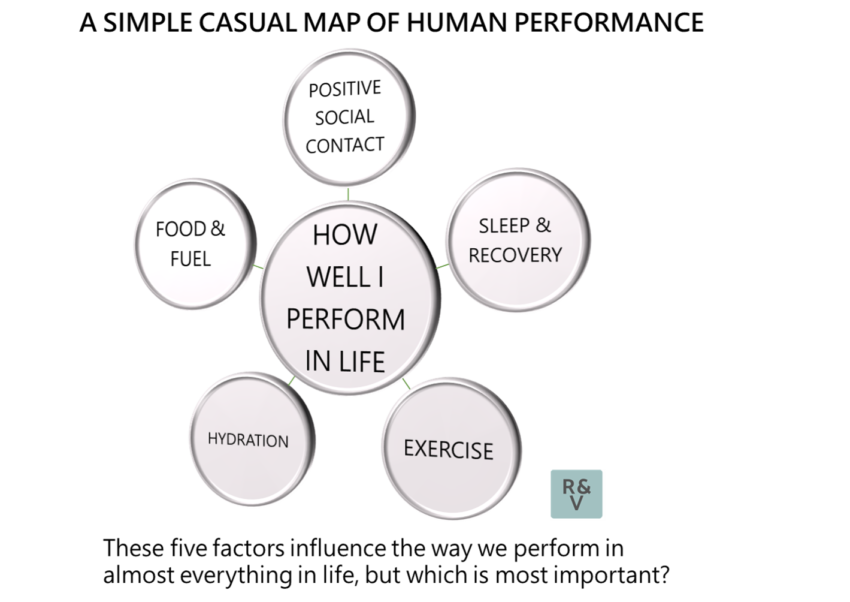
All it takes is a bit of wall or desk space and perhaps some Post-it notes and see how it goes for you. Set an issue or question in a central position and start to add links to people or factors that are relevant to the central issue. For instance, here’s a simple casual map of human performance.
Whether you are doing it as a private individual or business the important thing to remember is to try to structure it properly. Again, like a gym session you can either wander around a gym with no specific plan trying a bit of different things and you probably will still get some results, but you will get much better ones if you are following a session plan.
Software Solutions for Casual Mapping
If you want to make a soft copy map there are a lot of software options available, but for this purpose we are highlighting ones that don’t necessarily require competence at data scientist, coding or statistics to operate.
At the highest enterprise end there is Palantir, and in particular its Gotham application, and the i2 Analyst’s Notebook which was acquired by IBM and has been a bit of a staple in defence and security analysis for a long time.
However these two are definitely enterprise solutions and not the kind of thing you would want to map personal projects on. Unless maybe you are Bond-style villain and your personal project is an ambition to take over the world or something like that.
DataWalk and Visallo are two others solid contenders in the enterprise category, and Polinode and SocioViz can be used to map the relative importance of links by looking at electronic communication and social networking respectively.
For an application that can bridge personal use and enterprise use and can be used by a non-specialist to make a nice looking diagram, we like Kumu, and there is a nice page featuring all of the kinds of small and large, profit and non-profit types of projects it has been for on their website here. They also have a policy where they might waive their fees if you your project has public interest and you write them a handwritten postcard explaining why, which we think is a nice touch.
(1) An expression attributed to the Norwegian playright Henrik Ibsen, although similar sentiments of this kind have been attributed individuals including Leonardo da Vinci and Napoleon Bonaparte amongst others. It’s also something that just about everyone who has ever had to give a presentation in a corporate environment has been reminded about, whether they needed reminding or not.
(2) IEC 31010:2019 Risk Management: Risk Assessment Techniques pg. 87